
Friday, 11 March 2016


Thursday, 10 March 2016
Photoshoot
 |
| Image A |
All the images were taken in front of a brick wall as I felt that it would be a suitable background. It is plain enough to distract from the main body of the image but has some texture making it more interesting compared to a plain white background. However, for it to look good the framing had to be perfect. For example, in Image A, the photo was taken slightly from the right and therefore, the bricks look slanted and it makes the photo look less professional.
 |
| Image B |
 |
| Image C |
When I took the photos, I had already known that I would have liked them to be in black and white. Due to this, it did not bother me what the colours were like in the photo. If I were to use colour, I would have muted the colour of the wall, perhaps changing it to grey. The yellow brick does not suit the tone of any of my ancillary text which all uses either black or white or muted colours.
 |
| Image D |
Friday, 4 March 2016
Creating the Advertisment
For the advert I also used InDesign. After working on the digipack, I felt more confident using the program. I started the advert the same way I did for the digipack by creating a new document. I used the typical A4 dimensions and made the document portrait.
 Firstly, I added a black background using the Rectangle tool. Using the guidelines, I dragged the tool from the bottom right corner up to the top left corner to fill the entire space. After creating the background I could start on the text. I knew that I wanted the band's name above the album title so I placed it in the centre of the at the top of the page. I used the font Minion Pro which I what I used for my digipack. By making it white, it stood out from the background. Just like the digipack, I also added the iconic dots at the beginning and end of the text as well as the line underneath.
  Underneath, I wrote the name of the album. I used the same font and colour but instead of adding the dots I added a line above the text. It was placed under the main image, so the line on top of the text looked as if it was framing the photo. I felt that it filled the space better so the whole advert looked more complete.
  The main part of the advert was the block of information underneath the image. I continued using the same font ensuring consistency and a more recognisable brand. The release date was the most important piece of information so I decided to put it in a bigger font. The same goes for the information regarding what formats the album will be released in.
Most album adverts have some legal information in the bottom right corner. To ensure my digipack looked like a real digipack, I decided to place my legal information in the same place. I did not want into to overpower the rest of the advert, so I made the logos and copyright information smaller than the rest of the features.
At this point, I felt that the advert was not complete. There was still a lot of black space around the edges. To combat this, I created a white border which filled the space.Using the rectangle tool, I made one long vertical box and one smaller horizontal box. I filled them with white and copied them onto the other side.
The final result can be found here.
Using InDesign: The Process of Making a Digipack

 This square is just the cover page. To create the inside pages I went to Layout > Pages... > Add Pages. From here I could add the numbers of pages, including double spread pages. In order to have enough pages for everything I wanted to include, I added a minimum of five double page spreads, one front cover and one back cover. One these pages I aim to add; lyrics, credits, any extra artwork not used on the cover and a 'thank you' message.
Before Making the Digipack:

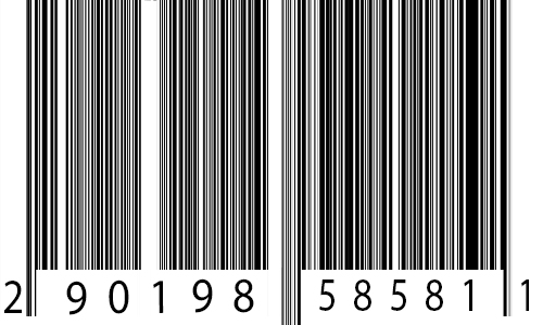
 Before starting, I had to create additional features in photoshop. For the back-cover I created a barcode with a made up UPC number. The barcode image was created easily by creating noise and dragging it out so it looks like long black lines of varying length. To add the noise I went to Filter > Noise > Add Noise and selected gaussian and monochromatic. I adjusted the amount to about 300% which created a good amount of noise. Once this is done I used the Single Row Marquee Tool to select a single row of pixels. Using Cmd + T to transform the selection, I dragged the selection up creating long black lines. Using the selection tool and the paint bucket I created areas of white space where the UPC number will be. After this, I used the Text Tool to add random numbers. Standard UPC codes have 12 numbers with one on its own at the beginning and one at the end. I replicated this to make it look as realistic as possible.
The final product looks like this:

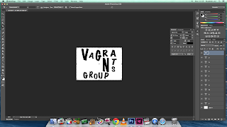 To avoid copyright issues I had to recreate the logos for the music companies associated with the band. The album was produced by 4AD which is a British indie label. When recreating their logo I changed their name to 5BE. The logo I produced is very similar to the 4AD logo with the black and white boxes. The parent company of 4AD is the Beggars Group. Like I did for 4AD, I changed the name of the company. I changed it to Vagrants Group as a vagrant is a synonym of beggar. Similarly, I made the logo for Vagrants Group with the Beggar Group's logo in mind. It features rough letters of varying shapes and sizes and even orientation.


 To avoid copyright issues I had to recreate the logos for the music companies associated with the band. The album was produced by 4AD which is a British indie label. When recreating their logo I changed their name to 5BE. The logo I produced is very similar to the 4AD logo with the black and white boxes. The parent company of 4AD is the Beggars Group. Like I did for 4AD, I changed the name of the company. I changed it to Vagrants Group as a vagrant is a synonym of beggar. Similarly, I made the logo for Vagrants Group with the Beggar Group's logo in mind. It features rough letters of varying shapes and sizes and even orientation.
 Both logos were created using Photoshop. Using the text tool I was able to type in the letters and reshape them to fit the image I wanted. For the Vagrants Group logo, I used the vertical text tool for the letters 'T' and 'S'. It meant that I could write them vertically and create the desired effect.

 The group Daughter tend to use old family photos for their album front covers, so I decided to pay homage by using family photos in the digipack. A common feature of digipacks are picture collages featuring the singer/band, so I took this one step further and created a double spread page of family photos. To create this I used photoshop as it gave me the means to crop and edit photos as well as collaging them together. First I imported all the photos I wanted to use. Using the crop tool I was able to cut out the background, and using the transformation tool I rotated the photo so it was straight. I copied the picture a pasted it onto a black canvas where I would start the collage. I repeated this process until I had edited all the photos. To fit the theme I adjusted the images so they were all in black and white. I did this by going to Images > Adjustments > Black & White. Lastly, I just had to move around the photos so they were overlapped and placed in a neat order.
The final product looks like this:

Making the Digipack:


For the front cover, I used the same font as the inside text. Again I used the dots and the line to tie in
with Daughter's aesthetic. For the album name, I kept the name 'Smother' as it is the last single on the album. I made the title smaller than the name of the band in true Daughter style. It establishes the band as the most important feature and it creates a strong association between the band and the album.
I used the back cover as a place to put most of the needed information. Using the Rectangle Tool I created a black bar at the bottom of the cover. In this bar I placed all the copyright information, social media links and the barcode. The two music company logos that I had produced early were also placed with the black bar. I used the same font as the previous pages to create a sense of continuity. All the information placed was influenced by the back cover of the 'Folie a Deux' album. It meant that I had a rough idea of what information is typically on a back cover.
 Above the black bar, I filled the rest of the space with the track list. It used the same font but instead all the letters were capitalised to create a clear definition between the names of the song and the additional information below it. At the bottom of the tracklist I wrote "Written by Elena Torna and Igor Haefeli, except where noted. Produced by Igor Haefeli." Some of the songs written for the album were written just by Elena Torna, therefore I added additional credits underneath the songs only she wrote.
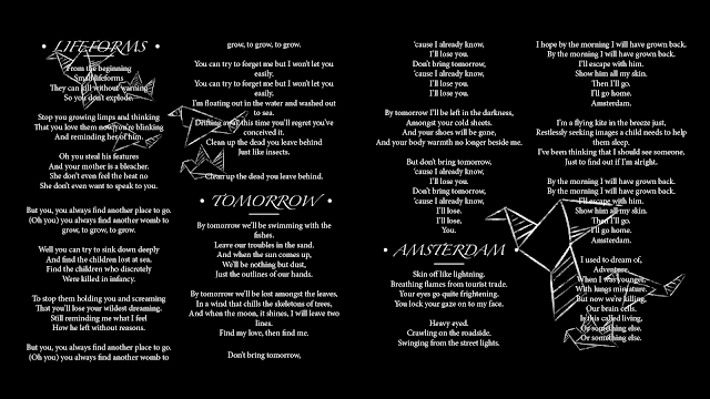
For the lyric pages, credit page and thank you page all share a similar background. I wanted to tie in with the theme of the rest of the booklet so I use the same colour scheme. I used muted colours and a simplistic design to make sure that the eye is not drawn away from the text. I could have left it blank as the text filled the space, but it did not look as interesting. Up until this point, everything had been in black and white, so I wanted to continue with the darker colours. I made the background completely black and added a few simplistic white illustration. The 'doodles' all were different types of paper craft such as paper planes and paper boats, but they all also had the a similar theme of 'travel' which links to a tone of the album. I created these images using Paint Tool Sai and a Wacom Bamboo graphics tablet. Using the 'chalk' brush I drew out the images on a black background. When they were finished I transferred them onto InDesign and placed it on a new layer separate from the text. I changed the text from black to white so it would stand out on the black background.
The final product looks like this:


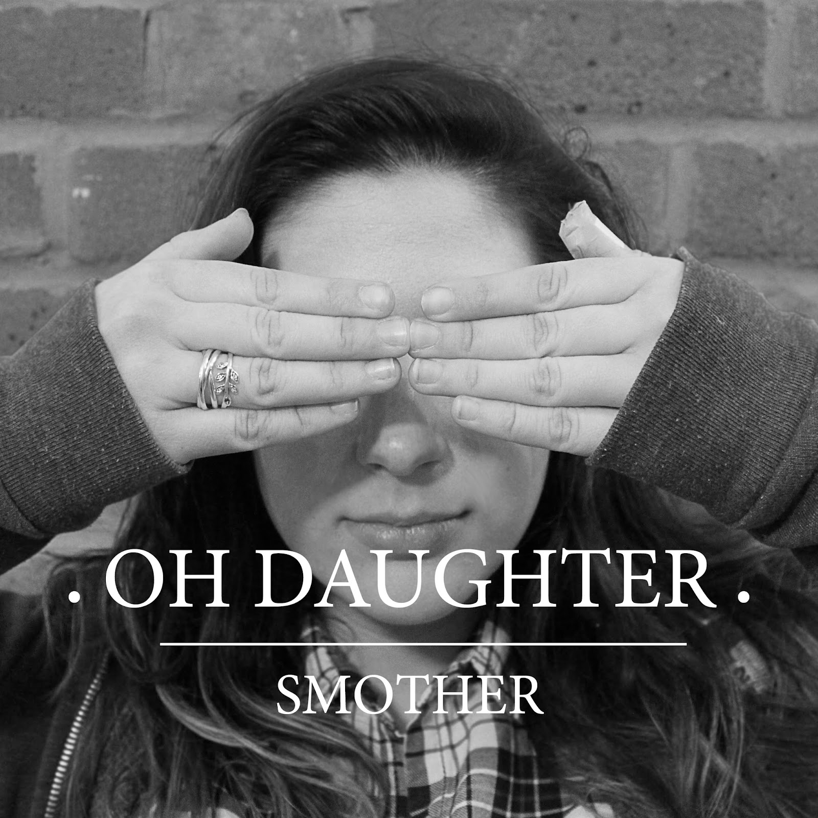
 To complete the digipack I added two photographs - one on the front cover and one on the back cover. The front cover features the person who starred in the video in front of a brick wall. It showed her with her hands in front of her face. Similarly, the back cover showed the same image but from behind. It creates a strong sense of continuity. As the rest of the digipack was in black and white, I used Photoshop to edit the two photographs so they also were in black and white. I did this so it would tie in with the theme and so it would not look out of place.
The completed back and front cover look like this:

Wednesday, 2 March 2016
Ideas for the Advertisement
After analysing various advertisements and Daughter photographs I started to plan my own album advertisement. From the research I did I knew that I needed to include features such as Elena's face (or in this case, the actor who plays Elena), the name of the band, the name of the album, the release date, the name of the number one single that features on the album and possibly even what platforms the album will be released on such as iTunes and Google Play.
An important feature of adverts is the link to the album. Most adverts use photos from the same photoshoot as the album cover photoshoot. It creates a strong link between the album and advert. In some cases, the picture becomes an iconic image which people imagine when they think of the band. When I create my own advert I plan to use the same image as the album cover. The association between images helps with advertising, as the audience automatically know what is being advertised. The image used on the album cover has been cropped to fit the digipack. For the advertisement, one idea is that I can use the full picture. The advertisement is meant to be for a magazine so it should be around the size of an A4 portrait piece of paper. Another idea is to use the cropped image and then create a black box around it where I would put all of the text. This is an idea used in the Florence and the Machine advert for the album 'Lungs'. I like this idea the most as it also links to the colour scheme of my digipack which is black, white and grey. It creates a strong sense of continuity which I something I aim for.
For the text I want to use the same font as the digipack which is Mono Lt. I also wish to use dots at the beginning and end of the band's name as well as the line underneath it. It is what I have done in both my digipack and my music video so I would like to keep up with the image. In all of my products, the name of the band has been above the name of the song and in a bigger font. For my advertisement, I intend to continue this idea by put the bands name at the top and put the album name in the middle. The text underneath will be smaller but centred just like the rest of the text. Another idea is to put both the name of the band and the name of the song together in the middle. This is like the album poster for Ellie Goulding's 'Lights'. However, it is important that the bands name is above the name of the album regardless of where they are both placed.
Everything I have worked on so far has had a black and white colour scheme. To create a sense of continuity, I want to continue with this theme. This can be done through the image used but also by the text and any additional features added. Most album posters use colour, however I feel it would suit my product better to use black and white. If I were to use colour I would use muted colours. Daughter's products often are muted as it matches the style of their music. The album poster for Daughter's "If You Leave" is an example of this. The pale colours link to the naturalistic visuals. If I were to use this idea, I would use colour in the photo and use black and white for the text.
 |
| Sourced from www.alicehoarlcmedia 1213.blogspot.co.uk |
 |
| Sourced from amazon.com |
 |
| Sourced from behance.net |
Reconnaissance of Potential Locations
Potential Locations for the Outdoor Scenes:
- Cooks Field - Cooks field is part of the school grounds as well as a public footpath.There is a lot of green space that is undisturbed. The actress will have to run in the video so it was essential that there was a lot of space. In addition to this, there are many long and establishing shots. It is important that there are no buildings or other features within the shot. Nonetheless, in some parts of Cooks field, there are football nets that could obstruct the picturesque view. However with careful framing, these could be hidden. It is very likely that I would choose this field as it is the most convenient to film. It means the everything can be filmed during a school day which is convenient for the actress. As it is part of the schools property it will also be easier to get permission to film there.
- Moatfield Park - The Moatfield is a field that is near me, so it would be convenient for me to use it. However as it is a public place I would need to be careful not to get people in the shot. Like Cooks field, there is also a lot of man-made features such park equipment and football nets. They take up a lot of space which will cause a problem when filming. It is very unlikely that I will choose this location for filming despite the convenience of it being nearby.
- King George's Park - Like the Moatfield, King George's is a convenient place to film as it is also nearby. There is a lot more land at King George's compared to the Moatfield but again as it is a public place there is the chance of accidentally getting members of the public in the shot. It will be harder to film here due to obstructions.
- Aldenham Country Park - After visiting I found Aldenham Country Park to be the most impressive place for filming. The reservoir and the forests made for some interesting shots. During the winter, it is not very busy so there is not going to many obstructions. It is also convenient because it is near.
Subscribe to:
Posts (Atom)