For the advert I also used InDesign. After working on the digipack, I felt more confident using the program. I started the advert the same way I did for the digipack by creating a new document. I used the typical A4 dimensions and made the document portrait.
 Firstly, I added a black background using the Rectangle tool. Using the guidelines, I dragged the tool from the bottom right corner up to the top left corner to fill the entire space. After creating the background I could start on the text. I knew that I wanted the band's name above the album title so I placed it in the centre of the at the top of the page. I used the font Minion Pro which I what I used for my digipack. By making it white, it stood out from the background. Just like the digipack, I also added the iconic dots at the beginning and end of the text as well as the line underneath.
  The main part of the advert was the block of information underneath the image. I continued using the same font ensuring consistency and a more recognisable brand. The release date was the most important piece of information so I decided to put it in a bigger font. The same goes for the information regarding what formats the album will be released in.
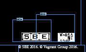
Most album adverts have some legal information in the bottom right corner. To ensure my digipack looked like a real digipack, I decided to place my legal information in the same place. I did not want into to overpower the rest of the advert, so I made the logos and copyright information smaller than the rest of the features.
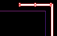
At this point, I felt that the advert was not complete. There was still a lot of black space around the edges. To combat this, I created a white border which filled the space.Using the rectangle tool, I made one long vertical box and one smaller horizontal box. I filled them with white and copied them onto the other side.
The final result can be found here.
No comments:
Post a Comment