Before filming my evaluation, I had to know what to say. After planning in rough, I wrote a full script which I later used when recording the voice over. Here is the final evaluation script:
1: In what ways does your media product use, develop or challenge form and conventions or real media products?
Before planning my own music video I did a lot of research into the conventions of a traditional music video. During this period I learnt about the types of music videos and common features used. Just like in TV and film; camera work, mise en scene and editing are used to convey the tone of the song as well as creating a deeper layer of meaning. During my research I also discovered that each music genre also have their own individual conventions. All the information I learnt was written up on my blog where I analysed music videos of different genres and types.
Researching the Andrew Goodwin Music Video Theory was extremely helpful when producing my own music video. I learnt that there are six keys that feature in most music videos.
The first key aspect is the relationship between the visuals and the lyrics. Visuals are used to amplify, illustrate or contradict the meaning behind the lyrics. Within this key there are three steps, which are as follows:
•
Firstly, we look at the music itself and its structure including choruses, verses and bridges.
•
Secondly we look at the main body of the song. The voice of the main artist can be unique and can be used as a form of identification or a trademark.
•
Thirdly, is the mode of address. Music videos are often in the form of a narrative so songs can be seen as storytelling devices.
In my own video, the clips were cut to emphasis the beat. I wanted to clarify the importance of certain lyrics, so I switched to the clip where it showed the actor lip-syncing. Watching her lip sync emphasises the words she is saying.
The fifth key is the frequent gestures and notions to looking and is particular the voyeuristic treatment of the female body in music videos.
An example of this in mainstream media is the male gaze. In videos such as Robin Thicke’s Blurred Lines there is the use of deliberate cuts to bring attention to certain female attributes. I avoided this convention in my own video. None of the angles or camera movements I used was used in an indecent way. In my opinion, I felt it was unnecessary to include this simply because it is not needed and the impact it has on the portrayal of women is negative.
The sixth and final key is the frequent use of intertextual references to TV shows, films, other music videos and other media.
Other forms of media including other music videos have been very influential when creating my own work. There are no direct references however; you can see the influence certain videos have had when watching my music video.
To make my music video look like a real music video, I knew I had to research what kind of things feature in typical music videos. Though I did not stick to some conventions, it was helpful to see what is popular in music video production. Traditionally music videos use a variety of different camera angles and movements however I noticed that certain types of shots were used more frequently than others.
Close ups are among the most common type of shot used. They are either used to show to artist or actor lip singing to the song or are used to show important features in the video. Close ups are used in videos such as Taylor Swift’s Shake it Off, Adele’s Hello, Coldplay’s the Scientist and many others. I used close ups in my own music video for the same reason – to show lip singing. Close ups allowed me to convey emotion which matches the tone of the song and also to emphasis certain lyrics that are important in the story of the music video.
Other types of shots that are often used are mid shots. Mid shots, like close ups are one of the most common types of shots. It shows a combination of the mise en scene but also a slight close up of the artist or actor’s face so that you can see the emotion conveyed. There are numerous videos that use mid shots but some examples are Avril Lavigne’s Girlfriend, Michael Jackson’s Smooth Criminal and Nirvana’s Smells Like Teen Spirit . In my own video it is the most used type of shot. It shows the action of the actor playing the guitar as well as showing the face so the lip singing can be seen.
Similarly, long shots or establishing shots tend to be used in most music videos. It shows everything in the surroundings and all of the action. They have been used in music videos such as, Sia’s Chandelier and Beyonce’s Single Ladies. I did not use long shots in my own music video as it the area of the projection was too small. If I had used long shots, it would have shown parts of the room that I did not want shown as well as affecting the framing of the shot.
When editing a music video, jump cut editing tends to be the most popular type of transition . When a video is cut to the beat using jump cuts, it creates a connection to the song and emphasises the rhythm. Jump cuts also feel likes a more natural type of editing. Most modern music videos want to create a natural feel so jump cut editing is the best type of transition to use. Examples of jump cut editing are Daughter’s Numbers and Twenty One Pilots’ Lane Boy. In my own music video it is the only type of transition used. It was simply because I liked the natural feel to it. It meant that I could use the cuts to emphasis the beat and highlight certain parts of the song. It created an underlying meaning behind the song. The lyrics do not make a lot of sense and are open to interpretation. By using jump cut editing I was able to emphasise parts of the song I felt were important and therefore what is shown is what I believe the song to be about.
For example, I wanted to go with the angle that the song could be about transition, specifically the transition from being a care free child to an adult . The use of natural imagery in the background was used to represent the sense of freedom that open spaces have. To me, the outdoors is reminiscent of childhood when everything is big, open free – the ‘world is you oyster’ mentality . I also wanted to convey the idea of moving on, which slightly links back to the idea of transitioning. In the background video, there is a lot of movement in the clip that draw the eye along with it. It created a flow which resembles the idea of movement and moving on.
As I wanted my video to look like a real music video, I mostly followed the conventions of a traditional music video however; I did not want to sacrifice creativity for traditionalism, so I challenged some of the typical conventions.
One genre that I did further analysis of it the indie/alterative genre. The song I had chosen is and indie song so I wanted to know what features a generally used in music videos for this genre. After analysing existing music videos and writing about my research on my blog, I found that most of the conventions are the same as a typical music video but there are a few defining ones.
Handheld camera shots are more frequently used in indie/ alternative music. An example of this is the video for Car Radio by Twenty One Pilots. The entirety of the video is not filmed with a tripod making the video clips unstable and shakey. It gives the video a sense of chaos, which adds a deeper meaning to the video.
Indie/ alternative music videos tend to focus more on performance and conceptual music rather than storylines. The emphasis is more on visual poetry – linking the lyrics to the visuals. This is unlike pop music videos where there is a lot of colour and dancing that don’t necessarily link to the lyrics. By using primarily performance-based video clips, my video was following convention.
There are three typical types of music videos . These are narrative videos, conceptual videos and performance based videos . Most modern videos use a combination of types but also try to have some sort of underlying narrative. An example of this is the video for Dance Dance by Fall Out Boy. The video follows the story of the boys going to homecoming, yet there are also performance aspects meaning that the video is a combination video. Most videos tend to have some sort of story or at least a beginning and an end however my video lacks narrative. I felt that it gave me the opportunity to explore the lyrics more and base the video on the lyrics rather than the story told by the lyrics . In this sense I challenged the conventions. I decided that I would focus more on the performance aspect as it is the type of music video that Daughter tends to use themselves in their older videos such as ‘Youth’. Other examples of performance-based videos are Panic! At the Disco’s This is Gospel and Green Day’s American Idiot.
Behind any creation or idea is inspiration. I picked inspiration from a variety of places such as Youtube videos, artwork, other songs and even other music videos. I used elements of everything I was inspired by and mixed it all together, creating ideas of my own. For example, the video for Taylor Swift’s Style starts with a fascinating visual where is shows Taylor herself overlayed with a video of the sea. This visual is what inspired the projection idea. I developed this idea by taking a video and laying it over a person.
The video for Stromae’s Ave Cesaria inspired my use of VHS home-video aesthetic. In the video the resolution is lower and the screen rolls. I recreated the same effect in my video by using an effect called Bad TV. I did not use this effect on the actual video but rather on the video that is projected in the background.
The Youtube video Moving at Midnight which is a music video of Pure by Blackbird also inspired my work. I liked the use of cuts to the beat as it created emphasis on the rhythm of the song. I also liked the use of silhouettes as it created an interesting visual. In my own video I developed the idea of using light to create interesting silhouettes as seen in my video.
2: How effective is the combination of your main product and ancillary texts?
In addition to the music video, I created a digipack and an advert that linked to the album. I started work by researching. All my ideas and plans stemmed from other digipacks and album posters. Without research, I would have been stuck for ideas. Initially, I started researching digipacks before I researched adverts. From my research I discovered that most digipacks include:
A front cover
Pages for lyrics
Credits
Thank you page / a message from the artist/band
Legal information
And a back cover.
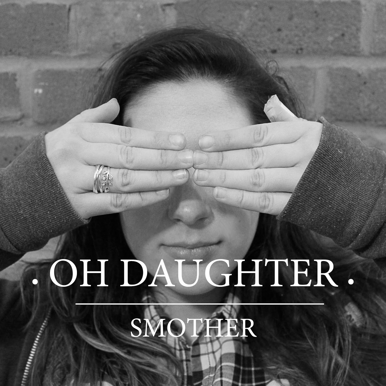
The front cover always has a large eye catching picture. Typically, the photo is part of the artist or band’s image . For example, Daughter are associated with this particular image found on the front of their debut album “The Wild Youth”. It is an image they continued to use on their second album “His Young Heart”. When taking my own photos, I took a picture of the actor who starred in the music video and used her face as the band’s image. I wanted to stay true to the band that originally created the song, which is Daughter . Daughter’s lead singer Elena Torna is at the forefront of the band. Her face is what is used to promote the band. For both my digipack and my advert I used a black and white theme. To tie in with this theme, my front cover image was in black and white. It better suited the rest of the digipack and because of that it did not look out of place.
During my research, I also learnt that front covers only tend to include the name of the band/ artist and the name of the album , so that is all I included on my own work. As the background was grey, I used white text. It made it stand out from the picture and therefore easier to read. At the beginning of my music video, the titles show the band’s name above the name of the song. I continued this over on my digipack, making the text larger than the name of the album. I also added the signature dots at the beginning and end of the band’s name to tie in with the band’s image.
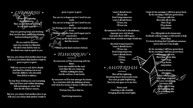
I also included a few lyrics pages so my digipack resembles a real digipack. I felt that these pages did not really need to be elaborate. Being simple makes it easier to look at. To tie in with the black and white theme, I made the background black. The lyrics on top were white, which made them stand out and easier to read. However, at this point I felt that the pages looked overly simple. To make it more interesting I added small doodles on each page. The 'doodles' all were different types of paper craft such as paper planes and paper boats, but they all also had a similar theme of 'travel' which links to a tone of the album. Like the text, I made the doodle white, but they were a faded white so the white text on top of it stood out.
For the last double page spread, I decided to also add a credit page and a thank you message page. Instead of using the Internet to research what information should be included I used digipacks that I found in my home such as the digipack for the ‘Folie a Deux’ album and for the ‘What We Saw from the Cheap Seats’ album. Looking at these digipacks gave me an insight into the kind of people who work on an album such as photographers and producers. In addition to this, it gave me an idea of what artist’s typically included in their thank you messages.
The back cover typically contains most of the legal information . As you can see on the back of the Folie a Deux album, there is a black box that contains: copyright information, the record label’s logo, the barcode and the band’s website. From my research, I learnt that this is exactly what most back covers include. On the back of the Bad Blood album, there is also legal information regarding piracy. It states, “Unauthorised reproduction is a violation of applicable laws.” Depending on the country and the record label the message changes. The aim is to prevent piracy and unlawful distribution . To make it clear to the audience it has to be visible on the album. At the bottom of my back cover I wrote: “All rights reserved. Unauthorised copying, reproduction, hiring, lending, public performance and broadcasting prohibited.” I placed this information at the bottom in a small font so it does not distract from the main body of the back cover, which is the track list. For the track list, I used the same font but instead all the letters were capitalised to create a clear definition between the names of the song and the additional information below it. At the bottom of the track list, I wrote, "Written by Elena Torna and Igor Haefeli, except where noted. Produced by Igor Haefeli." Some of the songs written for the album were written just by Elena Torna, therefore I added additional credits underneath the songs only she wrote.
The track list was placed over the picture. To create a sense of continuity, I wanted to use a similar image to the one on the front cover. As it was the back cover I wanted to take a photo of the same subject but from behind. Additionally, I used the same grey scale colour scheme to make the images look the same.
For an album to sell, it has to be promoted. Posters, TV and radio advertisements, social media posts and websites are all ways the music industry promote their artist’s albums. I decided that a poster would be the best way to advertise my album ‘Smother’. After researching and analysing album posters I discovered what sort of features and information typically are included. For example most albums include information such as the artist/band’s name, the name of the album, the name of the top single featured on the album, album reviews, record label information and the release date of the album. I included most of this as it is what an interested consumer would want to know prior to buying the album. In addition to this I also added where consumers can download the album and what forms the album will come such as CD and digital download.
Most album posters include a photo that it the same or similar to the photo used on the album cover. An example of this is Jessie J’s “Who You Are” album where it uses exactly the same photo as the album cover. This influenced my advert, where I used the photo from the front cover of my digipack. Some album posters such as Ellie Goulding’s Lights and Lady Gaga’s Born this Way use an extend version of the album cover photo so that it fills an A4 space, however some album posters such as Ed Sheeran’s Plus and Florence and Machine’s Lungs use the cropped version straight from the album cover. When I took the photos originally, they were landscape therefore could not be extended. I took influence from these album posters and used small photo rather than one that filled the entire space. The rest of the space I used for information. I preferred to do this as it also means that the text would be easier to read than if it had been placed on top of a picture.
To create a strong association between all the ancillary texts I used the same theme throughout the digipack and the advert. I continued to use the black and white colour scheme for my advert. As a colour scheme it is over used but it does effectively create a contrast which helps make the information stand out.
The picture and the text on its own looked boring. To make it look more interesting I added additional accents such as the border around the entire advert. It filled space and made the advert look fuller.
Typically, album posters have to include legal information such as the record label’s logo and copyright information. I used the logos that I created for the digipack and put it in the right corner. I did not what to make it any bigger as it would have stood out too much compared to the rest of the text. Typically, on any form of promotion the legal information is small. By following this, my advert looks like a real advert.
3: What have you learned from your audience feedback?
To find out my target audience I created a questionnaire . From this I could see what age and gender are my target audience, and what the target audience would like to see in a music video. In the questionnaire, I asked six questions , which included basic information about the participant, and general information about features of a music video they feel is important. The results influenced what I included in my own music video.
The first question was: Are you male or female?
75 % of the participants were female which mean that the results were biased. I felt that this did not truly represent a real audience for a music video. However, what I did learn is that from the males who participated had similar answers to the females. Gender did not have any influence on the likes and dislikes of the participants.
Questions two: What age group do you fall under?
There were eight age groups to choose from including:
•
Under 10
•
10 – 15
•
16 – 18
•
19 -25
•
26 – 35
•
36 – 40
•
41 – 59
•
60 +
Out of the people who watch music videos, 60% were aged 16 – 18. From this I knew that the demographic for my music video would mostly be teenagers. I kept this in mind when planning my own music video and made sure that the features I included were what this demographic wanted.
Question 3: How many times do you watch music videos per week?
The options for this video were:
•
Every day
•
Three times
•
Two times
•
Once
•
Never
12 people in total watch videos every day, which implies that these people are eager to watch music videos rather than just listening to the audio. This question was not important in finding out my demographic but it did emphasis that the participants are very interested in music videos and therefore they are more likely to know what they want to see.
Question 4: Where would be the first place you would watch a music video?
I gave the participants the options of:
•
Youtube
•
Websites
•
Apps
•
Music channels
They were also given an ‘other’ option where they could write other places they use to watch music videos.
15 people used Youtube over other platforms. If I were to publish this music video, the best place would be on Youtube as it is the most popular platform.
Question 5: What is your favourite music genre?
I gave the participants a long list of different genres and asked them to pick at least one favourite. Pop and Indie were the most popular at 29% each. Due to this, I decided to focus on these two genres. It helped me pick my song, which is from the Indie genre, with Pop aspects.
Question 6: What is the most important feature of a music video to you?
The options for this question were:
•
Features the band / artist
•
Video links to the lyrics
•
Performance /singing
•
Follows a storyline
•
Costume / make up
•
Features dancing
•
Props
Like question 4, the participants were also given an ‘other’ option.
According the participants, the most important features are that it features the artist and that it features performance aspects. I used these results and focused solely on these two features in my own work.
To support my research I also conducted an interview with people who had seen my music video. Before asking them to watch the video I asked them: What are your expectations for the music video?
I then showed them the video and filmed their reactions.
Questions asked:
•
What word comes to mind when you watch the video?
•
Did you feel that it looked professional?
•
What did you like the most about the video?
•
What would you improve about the video?
4. How did you use media technologies in the construction and research, planning and evaluation stages?
Throughout the planning and production processes, I used a variety of media and technology. For the filming, I had to use a selection of equipment including:
•
A DLSR camera
•
A tripod
•
SD card
•
A projector
•
And a screen.
The camera used was a Canon EOS 110D. It allowed for full 1080p filming, which meant that the quality of my video was significantly better. I filmed in the standard mode using the in-built auto focus to make sure my clips were sharp and in focus.
To keep the camera steady, I used a tripod. It was very usefully during the filming as I could not stand in front of the projector to film as it would have obstructed the video, but the camera on the tripod did not block the projector. The use of extending legs and rotating base meant that I could get every angle I needed. However, I found that for some shots it was not long enough so I had to place it on a stool to increase the height.
The screen was used to create a blank background to project the background video onto. The screen was easy to put up. It simply had to be pulled up using a handle. Thankfully, the screen was low enough for the actor to stand in front of. Other projectors in the school were screwed into the ceilings and could not be lowered. The projector I used was a mobile projector which meant that I could move it around with ease to fit onto the screen.
Additionally, other equipment I used included:
•
A camera battery
•
Extension cords for the projector
•
And my laptop to play the background video .
After I had filmed, I started the editing process. For this I used the same program that I used for AS media coursework – Final Cut Pro X . As I had used the program last year, I was confident using it again this year. Unlike last year, I used the multicam tool. When I filmed, I filmed the same thing from six different angles. Using the multicam tool I was to sync all the clips together on the timeline and then using the blade tool I cut between the clips, creating jump cuts timed to the beat of the song. I found this tool very helpful as the manual way of editing it would have taken longer. Once the clips were on the timeline I went in to manually correct each video. Using filters and colour correction tool I was able to adjust the contrast of the video. When I looked back at raw footage the video blended in with the actor’s face a bit too much. By adjusting the contrast it made the visual clearer.
For the evaluation, I used the same program to edit all my clips together. I manually edited all the clips together by dragging them down onto the timeline where I could shorten them using the in and out tools. Before editing the clips together, I used other forms of media to collect the visuals for the evaluation. Camista is a screen-recording program. I used this to capture videos from Youtube to compare to my own music video. In this program I was also able to resize the videos so I could place them side-by-side.
For my digipack and album advert I used InDesign. I had never used the program before, so therefore I was unfamiliar with the layout. However I found that after some practice the program was easy to use. To create the digipack, I opened a new document and changed it to a ‘compact CD’ in the options. The dimensions of the page are the same dimensions of a real CD. From here I added a four double spread pages and a back cover. Using the text tool, I was able to add all the information such as the lyrics and the album title on the front cover. To add the images I went to File > Place and picked the images. Once the images were added, I used the select tool to drag it to the right size. From here all I had to do was move everything into place. The same process was used whilst creating my advert. However, to create the black background and the white borders I had to use the rectangle tool to make the shapes I wanted.
Some of the images used in both my digipack and my advert had to be made specially. To create these images I had to use additional programs such as Paint Tool Sai and Photoshop. To create the two logos and the barcode on the back cover as well as the double page collage of home photos, I used Photoshop. Additionally, I used Photoshop to change the front and back cover images to black and white by going to Enhance > Convert to black and white. For the lyric pages I had to use some special equipment to create the images I wanted. I used a Wacom Bamboo graphics tablet with Paint Tool Sai which meant I could physically draw what I wanted. I started with a black background which was the same size as the double page spread. After this, I used the ‘chalk’ brush to draw the doodles. Once I was finished, I exported the pages as jpeg files and imported them onto InDesign.
After creating all my ancillary texts, I uploaded them onto different platforms. My blog was my main platform and it played important part in my research process. Blogger is an easy to use blogging platform that I could access from any computer or even my phone. At a click of a button I could create a new post and then just as easily publish it – sharing everything I’ve researched and learnt. The site supports most files which meant I could share my digipack, photos, advert, music video and even this evaluation. As Blogger is a Google owned site, it supports Youtube which meant that it was even easier to share my music video and evaluation.
Youtube was another important platform that I used in my creative process. Not only could I use it to research music videos and other influential videos, I could use it to upload my own experiments and final products.
Without all the different types of media, technology and equipment, I would have never been able to create the products I did and I would never have learnt what have learnt.
 To start the video I dragged down the clips onto the timeline. I then added the music underneath which I used to help with the timings. Before adding any other clips I wanted to mark out where the beats are in the music and where the cuts would be. I did this using the marker tool which left little blue tabs on the timeline when I pressed the 'm' button. It made it easier when it came to shortening video clips as I had a visual mark to show exactly when I needed to make the cut.
 Once the clips were cut down to size, I could edit the clips themselves. I wanted to change the lighting and colour settings so all of the clips matched but also to create the impression that they were all filmed at the same time. Using the colour preset 'Cold Steel' I was able to create a cool base colour. Using the saturation and contrast sliders I was then able to tweak the lighting so it matched the clip prior to it. The cool tones made the clips look older which was the aesthetic I was aiming for. To add to the old video theme I used a free Final Cut Pro plugin called 'Bad TV' (which can be found here.) The plugin created an old VHS feel to the clips, creating lines across the screen and static. It made the video look as if it was an old home video made on an old camcorder which adds to the theme. I repeated the process on all of the video clips, adjusting each on individually so it matched the rest. Additionally, the clips had to be stabilised because all the clips were shakey. I did this using the built in 'Stabilisation' tool. It made previously shakey clips look smooth and slightly more professional looking.


 Firstly, I added a black background using the Rectangle tool. Using the guidelines, I dragged the tool from the bottom right corner up to the top left corner to fill the entire space. After creating the background I could start on the text. I knew that I wanted the band's name above the album title so I placed it in the centre of the at the top of the page. I used the font Minion Pro which I what I used for my digipack. By making it white, it stood out from the background. Just like the digipack, I also added the iconic dots at the beginning and end of the text as well as the line underneath.
  The main part of the advert was the block of information underneath the image. I continued using the same font ensuring consistency and a more recognisable brand. The release date was the most important piece of information so I decided to put it in a bigger font. The same goes for the information regarding what formats the album will be released in.
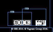

 This square is just the cover page. To create the inside pages I went to Layout > Pages... > Add Pages. From here I could add the numbers of pages, including double spread pages. In order to have enough pages for everything I wanted to include, I added a minimum of five double page spreads, one front cover and one back cover. One these pages I aim to add; lyrics, credits, any extra artwork not used on the cover and a 'thank you' message.
 Before starting, I had to create additional features in photoshop. For the back-cover I created a barcode with a made up UPC number. The barcode image was created easily by creating noise and dragging it out so it looks like long black lines of varying length. To add the noise I went to Filter > Noise > Add Noise and selected gaussian and monochromatic. I adjusted the amount to about 300% which created a good amount of noise. Once this is done I used the Single Row Marquee Tool to select a single row of pixels. Using Cmd + T to transform the selection, I dragged the selection up creating long black lines. Using the selection tool and the paint bucket I created areas of white space where the UPC number will be. After this, I used the Text Tool to add random numbers. Standard UPC codes have 12 numbers with one on its own at the beginning and one at the end. I replicated this to make it look as realistic as possible.

 To avoid copyright issues I had to recreate the logos for the music companies associated with the band. The album was produced by 4AD which is a British indie label. When recreating their logo I changed their name to 5BE. The logo I produced is very similar to the 4AD logo with the black and white boxes. The parent company of 4AD is the Beggars Group. Like I did for 4AD, I changed the name of the company. I changed it to Vagrants Group as a vagrant is a synonym of beggar. Similarly, I made the logo for Vagrants Group with the Beggar Group's logo in mind. It features rough letters of varying shapes and sizes and even orientation.
 The group Daughter tend to use old family photos for their album front covers, so I decided to pay homage by using family photos in the digipack. A common feature of digipacks are picture collages featuring the singer/band, so I took this one step further and created a double spread page of family photos. To create this I used photoshop as it gave me the means to crop and edit photos as well as collaging them together. First I imported all the photos I wanted to use. Using the crop tool I was able to cut out the background, and using the transformation tool I rotated the photo so it was straight. I copied the picture a pasted it onto a black canvas where I would start the collage. I repeated this process until I had edited all the photos. To fit the theme I adjusted the images so they were all in black and white. I did this by going to Images > Adjustments > Black & White. Lastly, I just had to move around the photos so they were overlapped and placed in a neat order.


 Above the black bar, I filled the rest of the space with the track list. It used the same font but instead all the letters were capitalised to create a clear definition between the names of the song and the additional information below it. At the bottom of the tracklist I wrote "Written by Elena Torna and Igor Haefeli, except where noted. Produced by Igor Haefeli." Some of the songs written for the album were written just by Elena Torna, therefore I added additional credits underneath the songs only she wrote.

 To complete the digipack I added two photographs - one on the front cover and one on the back cover. The front cover features the person who starred in the video in front of a brick wall. It showed her with her hands in front of her face. Similarly, the back cover showed the same image but from behind. It creates a strong sense of continuity. As the rest of the digipack was in black and white, I used Photoshop to edit the two photographs so they also were in black and white. I did this so it would tie in with the theme and so it would not look out of place.


