Before finalising my song choice I wrote out a script for the song 'Smother'. After consideration, I decided to change the song to something that would be more convenient to film. 'Smother' is a lot longer than the final song choice 'Amsterdam'. Originally I was going to cut it at 3:09 where the music is quieter so the video was not too long.
Wednesday, 13 January 2016
Tuesday, 12 January 2016
Analysis Daughter's Album Covers
To help me with designing the album cover I decided to analyse all previous album covers as well as any of the official Daughter photographs to inspire me. Firstly I looked at the covers of released albums such as 'If You Leave', 'His Young Heart' and 'Wild Youth'.
ALBUM COVERS:
The two EPs; 'His Young Heart' and 'Wild Youth' feature two of the most iconic Daughter album cover. They both feature young children, similar in features. The photographs look as if they are home photos which adds a feeling of nostalgia. This idea, despite being Daughter's iconic image however would be hard to replicate and I think it would not tie in with the song or the album theme.
However I do like the idea of replicating the old photo aesthetic as it resembles most of Daughter's album covers. I could replicate this using film photos such as the ones you would get from a polaroid or I can edit photos I have taken to create a grainy feel with low-key lighting.
In these two photos there are also a sample of the type of text the band use on all of their albums. White text is always used on the covers and the name of the band tends to be bigger than the name of the album.
The full studio album uses a picture of landscape rather than members of the band or the two iconic children. The image uses the same grainy feel as the other two images and the colour has been adjusted so it is not a vibrant. It links better with the songs in the album as the all have a naturalistic feel to them.
This idea is also something I would not replicate as it is rather bland and does not advertise the band. Nonetheless, this is something that I would like to replicate inside the digipack as it will go with the nature-related lyrics.
The text on this album is in black as the background behind it is white, but it uses a similar font to the other two album covers. The name of the band again is shown in large letters in comparison to the name of the album. This is an idea that I am inspired by and I would like to keep the tradition by using it on my album cover.
BAND PHOTOGRAPHS:
Elena Tonra as the lead singer is the fore-front of the band and her face is the image the band go by. In most photographs of the band she is often situated in the middle of the photograph and perhaps even standing in front of the other two members.
In my video there are no actors to play the other band members and there is only a representative of Elena. Therefore I shall not replicate an image similar to these two photos. As Elena is the 'image' of the band, I intend on only using her image on the album cover.
All three images show examples of Tonra's image which include her infamous bob and fringe, winged eyeliner and darker clothes. This is something that I should include in the photoshoot for the album cover (minus the haircut!) These photos also show great examples of poses that Tonra uses in photograph which I am influenced by.
In the first image it uses the same grainy, dark tone as the two EP covers. In addition to this, the third photo uses black and white to convey the same dark tone. This also something that has influenced my work. The second image is one of the few band images where it is colourful and bright. However it still does use a vignette to adjust the colour slightly to tie in with the rest of their images.
The third image resembles the black and white theme of the 'Youth' video. I was inspired by the simplicity of the photo and I know that I could use this effect to tie in with the album theme.
ALBUM COVERS:
 |
| Sourced from amusicblogyea.com |
 |
| Sourced from amusicblogyea.com |
However I do like the idea of replicating the old photo aesthetic as it resembles most of Daughter's album covers. I could replicate this using film photos such as the ones you would get from a polaroid or I can edit photos I have taken to create a grainy feel with low-key lighting.
In these two photos there are also a sample of the type of text the band use on all of their albums. White text is always used on the covers and the name of the band tends to be bigger than the name of the album.
 |
| Sourced from amusicblogyea.com |
This idea is also something I would not replicate as it is rather bland and does not advertise the band. Nonetheless, this is something that I would like to replicate inside the digipack as it will go with the nature-related lyrics.
The text on this album is in black as the background behind it is white, but it uses a similar font to the other two album covers. The name of the band again is shown in large letters in comparison to the name of the album. This is an idea that I am inspired by and I would like to keep the tradition by using it on my album cover.
BAND PHOTOGRAPHS:
 |
| Sourced from thefoxisblack.com |
In my video there are no actors to play the other band members and there is only a representative of Elena. Therefore I shall not replicate an image similar to these two photos. As Elena is the 'image' of the band, I intend on only using her image on the album cover.
 |
| Sourced from ohdaughter.BlogSpot.com |
In the first image it uses the same grainy, dark tone as the two EP covers. In addition to this, the third photo uses black and white to convey the same dark tone. This also something that has influenced my work. The second image is one of the few band images where it is colourful and bright. However it still does use a vignette to adjust the colour slightly to tie in with the rest of their images.
 |
| Sourced from fashionsoundtrack.com |
The third image resembles the black and white theme of the 'Youth' video. I was inspired by the simplicity of the photo and I know that I could use this effect to tie in with the album theme.
Naming the Album and The Band
To avoid legal issues I have to rename the album and the band whilst producing my digipack and advertisement. I wanted there to be some resemblance to Daughter so I researched into the conventions Daughter use for their albums and adverts.
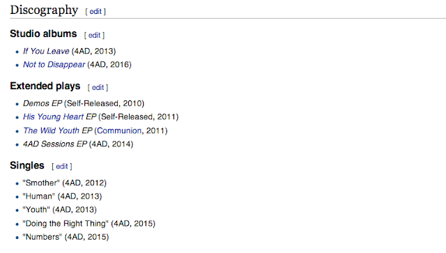
To choose the name of the album I decided that I could either use something that linked into the video or the chosen song, however after researching Daughter's albums I realised a trend. Daughter are synonymous for using lyrics from one of their featured songs as the album or EP title. The band in total have release one studio album and four EPs, including:

I researched each album (expect for the Demos EP and 4AD Sessions) and picked out the songs which the lyrics were used for the title.
The studio album, 'If You Leave' the song used was 'Shallows' which feature the lyrics:
The EP 'His Young Heart' featured lyrics from the song Candles:
To choose the name of the album I decided that I could either use something that linked into the video or the chosen song, however after researching Daughter's albums I realised a trend. Daughter are synonymous for using lyrics from one of their featured songs as the album or EP title. The band in total have release one studio album and four EPs, including:

I researched each album (expect for the Demos EP and 4AD Sessions) and picked out the songs which the lyrics were used for the title.
The studio album, 'If You Leave' the song used was 'Shallows' which feature the lyrics:
If you leave,
When I go...
You'll find me,
in the shallows.
The EP 'His Young Heart' featured lyrics from the song Candles:
Just a young heart confusing my mind, but we're both in silence
From the EP 'The Wild Youth', the title is taken from the song 'Youth' were the lyrics are:
We are the reckless,
We are the wild youth.
In 2016, Daughter plan on releasing a new studio album called 'Not to Disappear' which features the song 'New Ways'. The lyrics are:
I’m trying to get out.
Find a subtle way out.
Not just cross myself out.
Not just disappear.
Bearing this in mind, my intent is to follow this tradition whilst naming my album. The songs that I plan to feature in the album are:
- Winter
- Still
- Lifeforms
- Tomorrow
- Amsterdam
- Touch
- Shallows
- Smother
In the actual 'If You Leave' album, the last song in the track listing is the song that I used in the name of album. As I have changed the order I intend to use the last track in my track order, in this case; 'Smother'. From the lyrics I have choose the following excerpts:
- 'My Bones'
- 'Creators'
- 'In the Darkness'
- Or even, 'Smother'
When choosing a name for the band I wanted to sound similar to the actually band name. I pondered names such as 'Sons and Daughters' and 'Son's of Daughters', however these are names that are already used by other bands. I finally decided on a name that is unofficially used by the band, which is 'Oh Daughter'. The name is used on some of their social media accounts but however officially is not part of their image.
Testing Out Techniques
Before filming I decided that I wanted to practice some of the techniques I aim to use in the music video. All of the effects were created using Final Cut Pro X and were all easy to create. By using in-built features, I was able to change the speed and put it in reverse.
REVERSE CLIPS
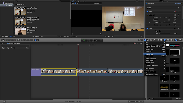
The first technique I tried was a simple reverse effect. This could be done by click the button that looks like a wand with an arrow curving over it. It opens a drop down menu where the 'reverse' effect can be selected.

Once this is selected you can change the speed of the reverse using the arrow in the green bar above the clip. For this example I kept it a 100% speed which is the normal speed.
The video below shows examples of reverse clips.
CHANGING DIRECTION
I wanted to take the previous effect further by changing the direction. For example The clip started in real time then is reversed. It then switches back to real time to create an interesting effect. This effect can be made using the same technique as before with some slight adjustments, however it can easily be created use an effect called 'Rewind'. It is selected using the same method as before - by opening up the drop down menu.
From this menu you can also adjust the speed of the rewind. For these examples I used 1x as it perfectly created the effect I wanted.
The following video shows examples of changing direction.
CHANGING SPEED
Using the same drop down menu as the two previous techniques, the video can be either speed up or slowed down using in-built effects. From here the amount the video is slowed down or speed up can be chosen. 100% is the normal speed, so 50% will be half that speed. When speeding up there is the choice to speed it up by 2x, 4x, 8x or 20x.
The video below shows examples of speed changing.
REVERSE CLIPS
The first technique I tried was a simple reverse effect. This could be done by click the button that looks like a wand with an arrow curving over it. It opens a drop down menu where the 'reverse' effect can be selected.

Once this is selected you can change the speed of the reverse using the arrow in the green bar above the clip. For this example I kept it a 100% speed which is the normal speed.
The video below shows examples of reverse clips.
CHANGING DIRECTION
I wanted to take the previous effect further by changing the direction. For example The clip started in real time then is reversed. It then switches back to real time to create an interesting effect. This effect can be made using the same technique as before with some slight adjustments, however it can easily be created use an effect called 'Rewind'. It is selected using the same method as before - by opening up the drop down menu.
From this menu you can also adjust the speed of the rewind. For these examples I used 1x as it perfectly created the effect I wanted.
CHANGING SPEED
Using the same drop down menu as the two previous techniques, the video can be either speed up or slowed down using in-built effects. From here the amount the video is slowed down or speed up can be chosen. 100% is the normal speed, so 50% will be half that speed. When speeding up there is the choice to speed it up by 2x, 4x, 8x or 20x.
The video below shows examples of speed changing.
Tuesday, 5 January 2016
Permission to Use Locations
Before filming I have to seek consent before using the location. I needed to find a location that would be big enough for the screen and dark enough for the projector to show up on video. I figured the best place would by the art department as there are free rooms and they were the ones supplying the projector.
Consent Forms
Before filming I had to seek the consent of all those involved in the filming of the music video. It ensures that all are happy to be filmed and are aware the purpose of the video. To seek consent I wrote a letter asking for permission to film them. The letter is as follows:
Prop List: Version Two
Due to the change of song, the amount of props needed has changed. Below is a complete list of everything that is needed during the filming of the music video.
Subscribe to:
Comments (Atom)


