Friday, 27 November 2015
Changing the Song
After some thought I decided to change the song for my music video. When starting to storyboard it I realised that the song was too long and I could think of enough ideas to add. I considered cutting the song so it was short but there was no place where I could make a clean ending. It would also be difficult to film in the location I wished to film as it is currently being used. I pondered use the song 'Smother' which is also by Daughter. It is a shorter song and the ideas that I am using for it are easier to film. However in the end, I settled on the song 'Amsterdam'. If I chose 'Smother' I would have to cut the song at 3:09 as to not bore the audience. 'Amsterdam' is shorter than 'Smother' and I would not have to cut it.
Tuesday, 24 November 2015
Reviewing and Analysing 'Numbers' by Daughter
Whilst researching and planning my own video, Daughter, the band behind the song of my choice released two music video. Previously to that, their last video was released well over two years ago.One of the videos if for the song 'Numbers' which is a single from their upcoming album 'Not to Disappear.' As it is a recent video I decided to analysis it so I could see if there is any change in their motifs, symbols and ideas.
The video starts with a black screen displaying the band's name and the song title. Both pieces of text used the same font that Daughter use for all their advertising and products. It creates a strong association between the band and the music video. A key aspect is that the band title is bigger than the song title. It emphasises the importance of the band.

The first shot is an establishing shot showing the motel environment and the tone. There is a heavy use of coloured lights, quickly imply a few key points. The colours flash and switch between blue and pink imply themes such as masculinity and femininity or danger and safety. These two colours are reoccurring throughout the entire video, emphasising these themes.
 At 0:17 there is a mid shot showing the side profile of the woman. It highlights her blank expression, hinting at her cold personality. At one point the pink and blue colours blur perhaps suggesting a contrast in themes. There is also the use of low-key lighting to foreshadow a darker theme to the video.

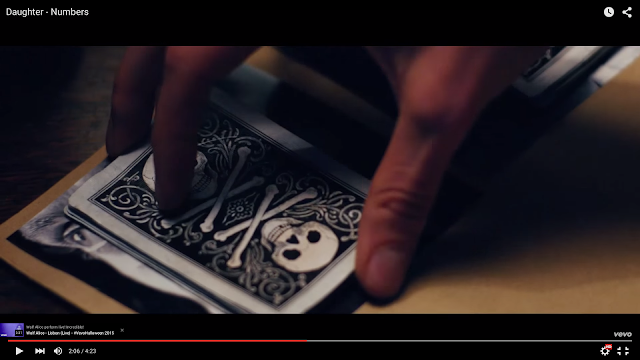
At 0:27 a high angled mid shot is used to highlight the importance of one of the key props. The women closes a brown folder with two pictures clipped to it. It is quickly recognisable as a profile that a collection of information about the two men that are later shown in the video. The theme of the video is immediately confirmed.

The shot is immediately followed by a close up which pans across the two photos clipped to the front of the paper folder. It lingers across the faces so the audience is aware that these two men are important later on.

During the same scene, a mid shot is used to show another key prop. As the woman moves across the screen the dress is reveal. The use of low-key lighting creates a contrast between the dark background and red dress. The colour red pops out, which highlights it as an important feature.

At 1:01 the beat kicks in and the mood changes as the scene changes. There is a close up tracking shot which shows the woman's side profile. As she walks, she walks to the beat creating emphasis on the rhythm.

It is followed by an establishing shot at 1:12. In continues to use low-key lighting, which implies that the city shown in the shot is sketchy or dark. It is supported by the prop within the shot such as a the two women who are dressed in a suggestive way as well as the neon lighting implying places such as casinos or betting shops.

Between 1:22 - 1:25, there is a pan between two preachers dressed in darkened clothes and the woman who stands out in her red dress. There is a strong contrast between these people. One idea I picked up on is that the woman appears to be superior to the men. She disregards what they are saying an lights up a instead.

At 1:39 a mid shot is used to show the woman as well as her surroundings. In this shot the use of low-key lighting creates a dark atmosphere as well as creating a silhouette of the women. It creates the image that she is a dark individual as well as implying that she is shady.

The first shot of warm colour is at 2:00. There is a mid/ establishing shot of a cafe with smiling faces and a sense of warmth. It contrasts with the way the woman has been displayed, emphasising her character.

Soon afterwards there is a cut away to a previous clip. The fast-paced cut away creates a sense of tension as it emphasises the beat. It reminds the audience of what has previously happened in the video as well as creating a connection between the two scenes.
At 2:28, colour comes into use again. There is a blue tone throughout this scene creating a sense of calm before the storm. The colour is also used in the performance aspect at 3:02 where the band are shrouded in a neon blue. It shows that they are the neutral feature of the video.

 Red lighting is also used in this scene. At 2:57 there is an over-the-shoulder shot of a man in the background and the woman in the foreground. The red light can be seen in the background in the form of the pink lampshade and the red lights of casino machines. The woman's red dress as plays it's part as a signifier. It hints towards the danger that is about to come.

Soon after this shot there is a close up of the man. It allows us to see closely that there is now blood dripping out of his mouth, confirming the danger that was foreshadowed in the previous shot.

At 3:41 there is a close up of the woman looking into the mirror. It is an over-the-shoulder shot so we can see what she sees, in this case, herself in the mirror. It shows her is warm yellow lighting for a change, perhaps suggesting she is more human now.

The video ends with a close up of elevator gates as the close and begin their descent. It starts at the top where there is a lot of yellow warm light. As it descends the light becomes white and sterile before descending into total darkness.

The video starts with a black screen displaying the band's name and the song title. Both pieces of text used the same font that Daughter use for all their advertising and products. It creates a strong association between the band and the music video. A key aspect is that the band title is bigger than the song title. It emphasises the importance of the band.

The first shot is an establishing shot showing the motel environment and the tone. There is a heavy use of coloured lights, quickly imply a few key points. The colours flash and switch between blue and pink imply themes such as masculinity and femininity or danger and safety. These two colours are reoccurring throughout the entire video, emphasising these themes.


At 0:27 a high angled mid shot is used to highlight the importance of one of the key props. The women closes a brown folder with two pictures clipped to it. It is quickly recognisable as a profile that a collection of information about the two men that are later shown in the video. The theme of the video is immediately confirmed.

The shot is immediately followed by a close up which pans across the two photos clipped to the front of the paper folder. It lingers across the faces so the audience is aware that these two men are important later on.

During the same scene, a mid shot is used to show another key prop. As the woman moves across the screen the dress is reveal. The use of low-key lighting creates a contrast between the dark background and red dress. The colour red pops out, which highlights it as an important feature.

At 1:01 the beat kicks in and the mood changes as the scene changes. There is a close up tracking shot which shows the woman's side profile. As she walks, she walks to the beat creating emphasis on the rhythm.

It is followed by an establishing shot at 1:12. In continues to use low-key lighting, which implies that the city shown in the shot is sketchy or dark. It is supported by the prop within the shot such as a the two women who are dressed in a suggestive way as well as the neon lighting implying places such as casinos or betting shops.

Between 1:22 - 1:25, there is a pan between two preachers dressed in darkened clothes and the woman who stands out in her red dress. There is a strong contrast between these people. One idea I picked up on is that the woman appears to be superior to the men. She disregards what they are saying an lights up a instead.

At 1:39 a mid shot is used to show the woman as well as her surroundings. In this shot the use of low-key lighting creates a dark atmosphere as well as creating a silhouette of the women. It creates the image that she is a dark individual as well as implying that she is shady.

The first shot of warm colour is at 2:00. There is a mid/ establishing shot of a cafe with smiling faces and a sense of warmth. It contrasts with the way the woman has been displayed, emphasising her character.

Soon afterwards there is a cut away to a previous clip. The fast-paced cut away creates a sense of tension as it emphasises the beat. It reminds the audience of what has previously happened in the video as well as creating a connection between the two scenes.

At 2:28, colour comes into use again. There is a blue tone throughout this scene creating a sense of calm before the storm. The colour is also used in the performance aspect at 3:02 where the band are shrouded in a neon blue. It shows that they are the neutral feature of the video.


Soon after this shot there is a close up of the man. It allows us to see closely that there is now blood dripping out of his mouth, confirming the danger that was foreshadowed in the previous shot.

At 3:41 there is a close up of the woman looking into the mirror. It is an over-the-shoulder shot so we can see what she sees, in this case, herself in the mirror. It shows her is warm yellow lighting for a change, perhaps suggesting she is more human now.

The video ends with a close up of elevator gates as the close and begin their descent. It starts at the top where there is a lot of yellow warm light. As it descends the light becomes white and sterile before descending into total darkness.

Friday, 20 November 2015
Props checklist Version One
To prevent confusion, lost props and forgotten items I composed a checklist of all props and additional items. It includes everything from props shown on screen, filming equipment and costume and make up.


Script: Version One
As my music video heavily relies on the beat and short clips to match, I produced a script which features what action happens every other second. I split it into scenes as there is a performance and a concept element to the video which means that the video had to be split into sections. Overall there are seven scenes involving scene changes. To mark location changes I placed the location inside brackets to highlight that it is important information. In addition to this I placed the corresponding lyrics underneath the stage directions to help with filming.


Tuesday, 17 November 2015
Ideas for the 'Smoke' Music Video
After choosing my song and after the research I did into music video types and conventions, I started to plan out my ideas for the song. The ideas are mostly inspired my the other media that inspired me in this post. In the mind-map below it features ideas such as the concepts I want to incorporate, themes, types of shots, editing techniques and key features.

Music Video Type
 |
| Video for 'Youth' by Daughter |
As the video was split into two halves, one half became the performance half with the singer featuring in a separate location to emphasise the performance half is different to the conceptual half.
 |
| Video for 'Now' by Paramore Concept: Powder represents blood and death. |
Themes
The idea of smoke I have interpreted as the feeling of haziness and perhaps even confusion. It plays with the idea of disintegration, which in turn could represent the loss of memories or even death. The line 'There's a man with no face just a blurred out portrait' could imply the loss of memories in regards to the person whose face she cannot remember. Other examples are as follows:
- "There's three doors and no keys" - This could represent the concept that she can visualise her memories but she just can't make sense of it.
- "I'm losing again, I'm losing my friend" - The concept of losing memories of a friend, even losing memories of herself.
- "We're blind and slowly suffocating, we're dying" - The loss of memory is 'suffocating', over-coming her.
This concept of being over-come with loss of memory inspired my idea of using powder paint to show the singer being consumed by 'brain fog'. Throughout the video I aim to show the consumption by painting the powder on the singer and every so often adding to it to show the gradually disintegration.
Types of Shots and Editing
 Slow motion emphasises key aspects of the clip. For example I aim to use it in scenes with the powder paint to accentuate the motion of the powder so it looks like smoke. A similar use of slow motion is used in the video for 'Now' by Paramore as shown in the following gifs.
 Another editing technique I aim to try is to switch between speeds. It is a good way to emphasise beat and create interest. For clips involving powder paint I wish to try to show the powder being thrown in slow motion before being speed up when it makes contact with the actor.
When slowing down the shots, anything that involves lip syncing would have to be filmed differently. Throughout the filming I will play the song to make acting and lip syncing easier. However for shots that are slowed down, the music will need to be speed up so that the lip syncing is still in time.
Reverse-shot:
 Reverse shots are an interesting effect which creates an massive impact. It is unexpected, especially when it only last a brief moment in the video. This effect is used in PJ Liguori's 'Colour Bandit' which also uses powder paint as the key prop. In the following gif, it shows the actor blowing out powder paint. The use of reverse shots makes it look as if he is inhaling the powder instead. Afterwards it plays normally creating an interesting contrast.
Thursday, 12 November 2015
Ideas for My Music Video

Types of Music Videos
Performance:
 |
| Shake It Off - Taylor Swift |
The performance aspect is something that I wish to include in my music video, however I would only like to include it as part of a hybrid video. Performance on it's own can be a tedious and repetitive type of video, therefore I would only like to add a smaller amount of performance in my video.
 |
| Uptown Funk - Mark Ronson |
Out of all the songs that I have chosen as possible choices, they are all guitar based. Due to this I would incorporate the use of guitar in the performance, possibly just a solo singer and guitar player rather than a band. Lip syncing would also be a vital part of the performance aspect. It is a common feature that is shared by most music videos such as; Shake it Off by Taylor Swift, Uptown Funk by Mark Ronson, Lane Boy by Twenty One Pilots and many more.
 |
| Use of lightbulb |
 |
| Performance |
As it is a performance I questioned whether I should use props such as microphones to emphasise that it is a performance. This idea was inspired by the video for 'Ignorance' by Paramore, where the lead singer uses a lightbulb as a microphone. It is unconventional but extremely unique idea which demonstrates that one idea can be used but twisted to have a more inventive visual. In the same video she is also seen using a normal microphone where she stages on stage with the band members, 'performing' the song.
Conceptual:
According to thefrisky.com the most common themes for songs and music videos are:
- Loss
- Desire
- Aspiration
- Nostalgia
- Pain
- Breakup
- Rebellion
- Inspiration
- Jadedness
- Escapism
- Desperation
- Confusion
When choosing a theme, this list inspired me and informed me what the most loved and common concepts. A few of these themes jumped out at me as being the most interesting and relevant to my song choices. The themes of loss, nostalgia, confusion, desperation and confusion link to all my song choices so I highlighted them as themes to focus on. I intend to use metaphorical imagery to portray these themes. It matches the metaphorical language that Daughter uses in all her songs.
Effects
The effects I would like to try and use are slow motion, overcranking, undercranking and using coloured lights to imply a certain tone within the music video. These three effects are used in a lot of music videos of all genres, mostly in more dramatic and emotional videos.
Slow Motion/ Overcranking:
Slow motion has been used in many videos but one good example is 'This is Gospel - Piano Version' by Panic at the Disco. Even in the original music video slow motion is used but in moderation compared to the piano version. The entirety of the video is filmed in slow motion however it is not very obvious until the confetti is poured onto the piano. In the behind the scenes video it is shown that the music is speed up whilst filming, therefore when it is slowed down it appears to be in time.
In Gif A you can see that the lip syncing is in time to the music and it is not obvious that the singer is actually singing at twice the speed. However in Gif B it becomes clear that the video has been shot in slow motion when the confetti starts to fall. The singer's hair starts to move and it is very obvious that it has been slowed down.
Undercranking:
Undercranking is shooting a scene slower that what it will appear on screen, therefore ending up with the action being sped up. This is a rarer effect but is still used often in music videos. Just as 'This is Gospel' is shot in slow motion, Panic at the Disco's next song 'Emperor's New Clothes' uses overcranking to create a different effect to match the different tone of the song. Just as the song in 'This is Gospel' is played at a faster speed, 'Emperor's New Clothes' is played at a slower speed so when it's speed up it is at the correct speed.
In Gif C it shows the singer at a normal speed. It is guessed that his actions were slowed so that it appeared normal on screen. Afterwards the speed kicks in, at the actions appear to be chaotic and frantic. The switch in speed is what I am most interested in. It creates a huge impact that when placed to the beat which can evoke emotion in the audience. In this case it creates a sense of panic and urgency. In Gif D, the video continues using undercranking further continuing the sense of urgency. All the actions are in time to the beat which again evokes emotion.
Use of Colour Lighting:
Colour can be used as a signifier for emotion and tone. For example blue in a music video can represent a sense of sadness whilst red can convey danger. In my own video I would like to use colour in order to get across emotions that may not be so obvious in the actions.
In one of Daughter's video colour is an important feature. 'Numbers' is one of Daughter's few music videos and it perfectly captures the chilling tone of their music. At the very beginning the video is still. The only movement is the blinking lights, switching from pink to blue. They are contrasting colours which could convey masculinity vs femininity or even sadness vs happiness. In my opinion it foreshadows the contrast between the femininity of the killer and the masculinity of the victims. Colour is often used to foreshadow the outcome is music videos, films and theatre.
Another example of colour usage is 'Moving at Midnight' by Sophie Newton. The entire video uses colour
as the main feature, with only the dark silhouettes as the other features. The colour chosen for each part of the song represents the tone of the music for example, when the music builds up more orange-y and red tones are used to convey a sense of chaos. When the female dances is a beautiful and elegant way calmer colours such as blue is used. On the other hand when the male dances the colours are more vibrant, with the use of reds and yellows.
Slow Motion/ Overcranking:
 |
| Gif (A) |
 |
| Gif (B) |
In Gif A you can see that the lip syncing is in time to the music and it is not obvious that the singer is actually singing at twice the speed. However in Gif B it becomes clear that the video has been shot in slow motion when the confetti starts to fall. The singer's hair starts to move and it is very obvious that it has been slowed down.
Undercranking:
 |
| Gif (C) |
 |
| Gif (D) |
Use of Colour Lighting:
 |
| 'Numbers' - Daughter |
 |
| Female dancing in 'Moving at Midnight' |
Another example of colour usage is 'Moving at Midnight' by Sophie Newton. The entire video uses colour
 |
| Male dancing is 'Moving at Midnight' |
Tuesday, 10 November 2015
Assessing Risks
Before filming I had to assess what could be a risk. I considered the locations as well as some actions that could potentially hazardous and tried to find ways of solving them. However there are no serious risks involved in the filming of the music videos, otherwise it would have been taken out so there is no risk. During the filming there will also be supervision of the location owners to prevent anything from happening.

Asking Permission To Use the Song
Prior to the production of the music video I had to seek out permission to use the song 'Amsterdam' by Daughter. To do this I sent a letter to the record company and asked for permission to use the song for a non-profit purpose. The following is what I sent to the CEO of 4AD, Simon Halliday:

In the letter I confirmed the intention of the music video and that it would not be used for any other purpose other than for school coursework. I also included information about my self and the course to confirm that what I am doing is for educational purposes only.

In the letter I confirmed the intention of the music video and that it would not be used for any other purpose other than for school coursework. I also included information about my self and the course to confirm that what I am doing is for educational purposes only.
Digipack Research
What is a Digipack?
Digipacks resemble the theme and conventions of the artist genres. Brand images and motifs are often incorporated to connect the pack to the artist. If also may emphasise lyrics and tones of the songs in the album, EP or single.
Below is a template of a single disk digipack. It shows the way a digipack is made and how many sides are needed to make two panels.
 |
| Sourced from cdmakers.com |
Folds of a digipack
Digipacks are typically folded to fit a square. They can fold in many different ways and can have many panels. The front is like the front of a book or a DVD. It is used to promote and identify the album so therefore consists of features such as:
- Large eye-catching picture
- The title of the album, EP or single
- Items relating to the artist/band such as a picture
- The name of the artist/band
The back is also used to promote and identify the album but is consists of different features such as:
- The track list
- The record label
- Bar code
- Some credits
- Album artwork
- And sometimes also the name of the name of the artist/band or the album title.
The inside panels are subtler than the front and back with less information on them. They consist of:
- Other album artwork that has not featured on the front or back
- Information about the discs
- Personal thanks for the artists/bands
- Lyric quotations from songs on the album.
Some digipacks contain a booklet containing extra information, lyrics and words from the artist/band. In this example from the 'What We Saw From the Cheap Seats' album by Regina Spektor. In the booklet it features:
- Extra album artwork
- Lyrics of songs on the album
- Illustrations
- A list of featured musicians
- Legal information such as credits to companies that worked on the album
- A special thanks from the artist / 'This album is dedicated to...'
(Include images of booklet lyrics, dedicate page, credit page, artwork/illustration)
Digipacks have a lot of creative space in making a booklet which means that they are all rather varied. Some digipacks will include a lot of information whereas some will be purely artwork. Below are some examples of digipacks and what they include in their booklets.
Examples of Digipacks
'Loud' - Rihanna (2010)

'Bad Blood' - Bastille (2013)
.png) |
| Sourced from wikipedia.com |
 |
| Sourced from amazon.com |
Booklet Back Cover: The back cover of the booklet features a simple image of a crowd and it lacks any information. Most of the information is found on the plastic covering back cover so therefore no information is needed on the booklet back-cover.
Packaging Back Cover: The back cover on the packaging includes the track list for the album. It is in a similar font to the title on the front cover to create unanimity. It also features the timings for each song which is a rather uncommon feature. Other information includes the company that produced the album, the bar code, copyright information and band information such as their website.
 |
| Sourced from coverlib.com |
 |
| Sourced from absolutepunk.com |
'Folie a Deux' - Fall Out Boy (2008)
Front Cover: The front cover is printed on the booklet insert and features the title and the name of the band. The two pieces of text are similar in font and size however the name of the album is in yellow rather than in white like the name of the band. The middle word of each test is smaller and not bold unlike the other two words. The cover also features an illustration of a grizzly bear carried by a man in a bear suit, which has become synonymous with this particular album. The tone of the cover is red which is continued throughout the rest of the album.
Booklet Back Cover: The back cover of the booklet is completely blank, only feature the red gradient of the front cover. There is no need for for anything on the back cover as all the information is either on the back cover of the packaging or in the booklet itself.
 |
| Sourced from amazon.com |
 |
| Sourced from trololoblogg.blogspot.com |
Subscribe to:
Comments (Atom)